
Leadpages makes creating mobile-friendly pages simple, even without coding skills. But to truly shine on mobile, a few extra tweaks help.
Small changes in layout, spacing, and design can improve readability and engagement. Your goal is to create a smooth, distraction-free experience for every visitor.
A clean mobile layout keeps attention on your offer, not the scrolling. Optimized images and headlines ensure your message loads quickly and clearly.
Let’s learn how to make your Leadpages pages mobile-ready. Each step will help you boost user experience, lower bounce rates, and capture more conversions from mobile users.

Why Mobile Optimization Matters for Landing Pages
More than half of all internet traffic today comes from mobile devices. That means your landing page must look great and load quickly on phones.
If your page feels cluttered, hard to read, or slow, visitors leave fast. Every second matters when people browse on smaller screens.
Mobile Users Have Short Attention Spans
People scrolling on their phones expect instant results. A delay of even a few seconds can cost you leads.
If the text is too small or the buttons are hard to tap, users bounce quickly. A mobile-optimized page makes every element easy to read and interact with.
Better Experience Means More Conversions
A smooth mobile experience keeps visitors engaged longer. When your page loads fast and looks clean, it builds trust and encourages action.
Clear calls-to-action and mobile-friendly layouts boost sign-ups, sales, and downloads effortlessly. A mobile-ready page helps you capture more opportunities, every time.

How Leadpages Handles Mobile Responsiveness
Leadpages templates come automatically optimized for mobile responsiveness. That means your design adapts smoothly to different screen sizes.
But sometimes, a few elements still need fine-tuning to look perfect. A few tweaks can make your Leadpages landing page truly mobile-ready.
Customize with the Drag-and-Drop Editor
The Leadpages drag-and-drop editor gives you full design control. You can easily adjust images, text spacing, and button sizes for smaller screens.
Preview in Multiple Views
Before publishing, use the preview feature to test desktop and mobile versions. This ensures your page looks professional and consistent across all devices.
Step 1: Keep the Design Simple and Clean
When designing your mobile landing page, simplicity always wins. Too much clutter can distract visitors and make navigation frustrating.
A clear layout helps users focus on your main message instantly. Here are a few tips to keep things clean and effective:
- Avoid clutter: Too many elements make it hard to scan and act.
- Limit visuals: Use one strong image or short video to guide attention.
- Focus your message: One clear headline works better than several confusing ones.
- Use white space: It helps break up sections and improves readability on small screens.
- Keep your CTA visible: Place one strong call-to-action above the fold.
Readable fonts are essential, too. Choose clean, sans-serif fonts that scale well on mobile devices.
Make sure text contrasts clearly with the background so users can read comfortably. A simple, focused design helps visitors take action fast.

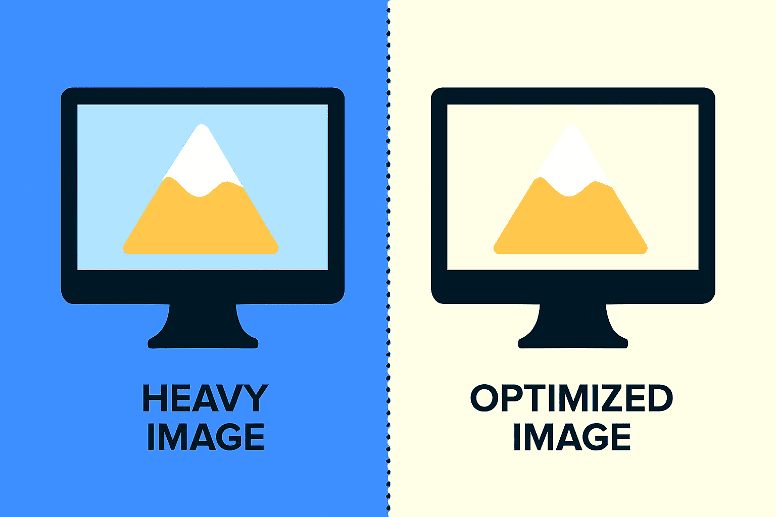
Step 2: Optimize Your Images and Videos
Images and videos make your landing page engaging, but they must load fast. Slow-loading visuals can drive away mobile visitors instantly.
| Tip | Why It Matters |
| Compress images | Reduces load time without sacrificing visual quality. |
| Embed videos | Saves storage and loads faster using YouTube or Vimeo. |
| Check display | Prevents cropping or stretching issues on smaller screens. |
Compress and format media properly for smooth performance. Optimized visuals create a seamless, professional experience that keeps visitors engaged.
Step 3: Adjust Button Size and Placement
Buttons play a huge role in mobile conversions. If they’re too small or placed awkwardly, users may miss them entirely.
Make sure every button is easy to tap and clearly visible on any screen size. Here’s how to do it right:
- Use large buttons: They should be big enough for thumbs to tap easily.
- Add spacing: Keep enough room between buttons to avoid accidental clicks.
- Highlight your CTA: Use a bright color that stands out from the background.
- Position strategically: Place your main call-to-action in the center or bottom.
A well-placed button guides users smoothly toward taking action. Keep it simple and bold.
Step 4: Speed Up Your Page Loading
Speed is everything for mobile users. If your landing page takes longer than three seconds to load, most people will leave.
Leadpages helps optimize speed automatically, but you can make it even faster. Try these quick fixes:
- Use Leadpages’ built-in tools: They automatically compress and optimize elements.
- Limit extras: Too many scripts, widgets, or pop-ups can slow things down.
- Compress images: Smaller file sizes improve speed without losing quality.
- Test performance: Use Google PageSpeed Insights to check your loading score.
A fast-loading page creates a smoother experience and improves conversion rates.

Step 5: Test Your Page on Different Devices
Your landing page may look perfect on your computer, but that doesn’t mean it’s flawless everywhere.
Mobile devices vary in screen sizes, operating systems, and browsers. Testing your page across multiple devices ensures every visitor gets a smooth, professional experience.
Let’s break it down step by step:
Use Leadpages’ Built-in Preview
Leadpages offers a preview tool that lets you view your page in desktop and mobile modes.
You can quickly switch between views to check spacing, font sizes, and button placement.
It’s a great starting point before testing on actual devices.

Test on Real Devices
Always open your page on your own phone or tablet to see how it performs. If possible, test on both iPhone and Android because screen layouts differ slightly. Check if all images load properly and if the text remains readable.
Look for Small Issues
Sometimes, buttons overlap or forms appear too long on smaller screens. Take note of anything that feels off or difficult to navigate.
Fix those details directly in the Leadpages editor before going live. Regular testing helps you catch issues early and deliver a polished experience.
Remember: a mobile-friendly landing page builds trust and boosts conversions fast.

Bonus Tips for Higher Mobile Conversions
Small tweaks can make a big difference in your mobile landing page performance. Optimizing your layout and interactions helps visitors act faster and stay longer.
Here are some extra tips to boost conversions and make your page stand out.
Keep Forms Short and Simple
Long forms scare away mobile users who prefer quick actions. Ask only for essential details like name and email to increase sign-ups. You can always collect more information later through follow-ups or surveys.
Use Sticky Call-to-Action Buttons
Sticky buttons or headers make your CTA visible as users scroll. They help visitors take action without scrolling back up the page. This improves convenience and ensures your offer stays front and center.
Personalize the Mobile Experience
If possible, show personalized content based on location or previous visits. Tailored messages feel more relevant and can double engagement rates. Even small touches like greeting users by name can boost trust.
Add Click-to-Call Buttons
For service-based businesses, a click-to-call button drives instant action. It allows potential clients to contact you directly from their phone.
This reduces friction and helps convert visitors into leads faster. Mobile users expect convenience and clarity. Keep every element focused, friendly, and easy to interact with.
Conclusion
A mobile-friendly landing page means a smoother experience and better conversions. Fast load times, clear CTAs, and simple layouts keep users engaged longer.
Use Leadpages’ tools to preview and fix your mobile design easily. Check your current landing page on your phone and spot weak areas.
Make small improvements today to see real results in performance and sales. These small optimizations turn casual visitors into loyal customers.


