
Best Tools for Creating Websites, Landing Pages, Courses, and Selling Digital Products
You’ve probably thought about this already. Build a website, create a simple page, maybe sell a course or digital product online without writing a single

When a landing page works, it feels like this:
You land, you understand the offer, you trust the person behind it, and you know what to do next.
In this guide, I will show you a few simple steps that consistently produce exceptional pages. Not fancy pages. Pages that help the right people take action.

A landing page is not a website page that tries to do everything. It is a focused page with one main action.
That action can be:
Sign up, book a call, request a quote, download a guide, start a trial, buy one product.
If you want a quick rule that keeps you out of trouble, use this:
One page, one offer, one next step.
Here is a simple table that helps you match the page type to the goal.
Page type | Best for | Main action |
Lead magnet page | Grow your email list | Get the download |
Booking page | Services and coaching | Book a call |
Webinar page | Teaching and selling later | Register |
Product page | One main product | Buy now |
Application page | High ticket services | Apply |
Event page | In-person or virtual event | Get a ticket |
When you keep the goal clear, design becomes easier.

This is where most people mess up.
They build a landing page, then they add the full menu, then they add three different offers, then they add a blog link, then they wonder why nobody takes action.
If your landing page has one job, protect that job.
Here is what I recommend.
A quick test that works:
If a visitor reads your headline and then asks, “So what do I do now?” your page is unclear.
Exceptional landing pages speak to a specific person with a specific problem. They do not try to sound smart. They try to be understood.
Before you write anything, answer these two questions.
Then build one clear promise around that.
Here is a way to write your promise.
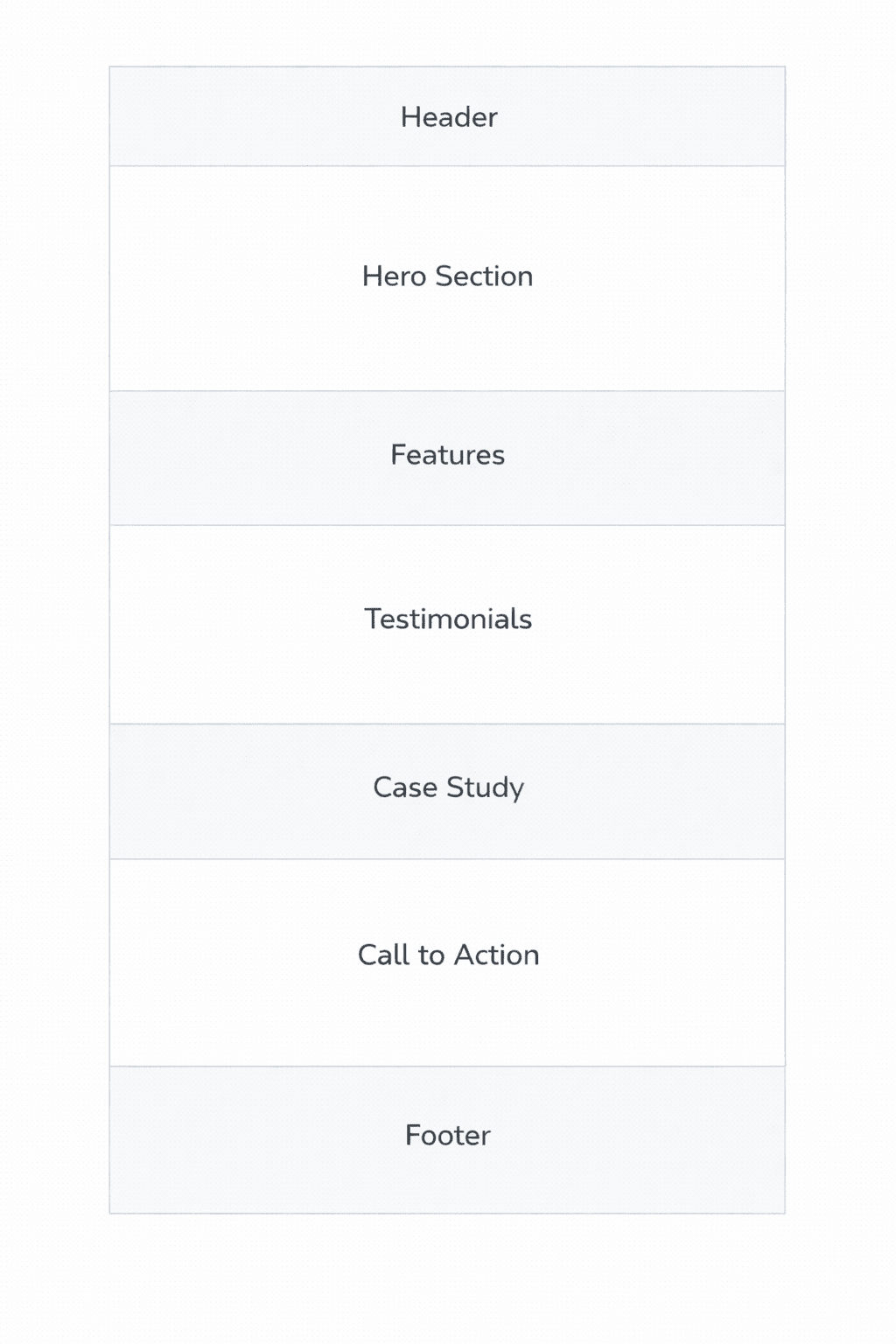
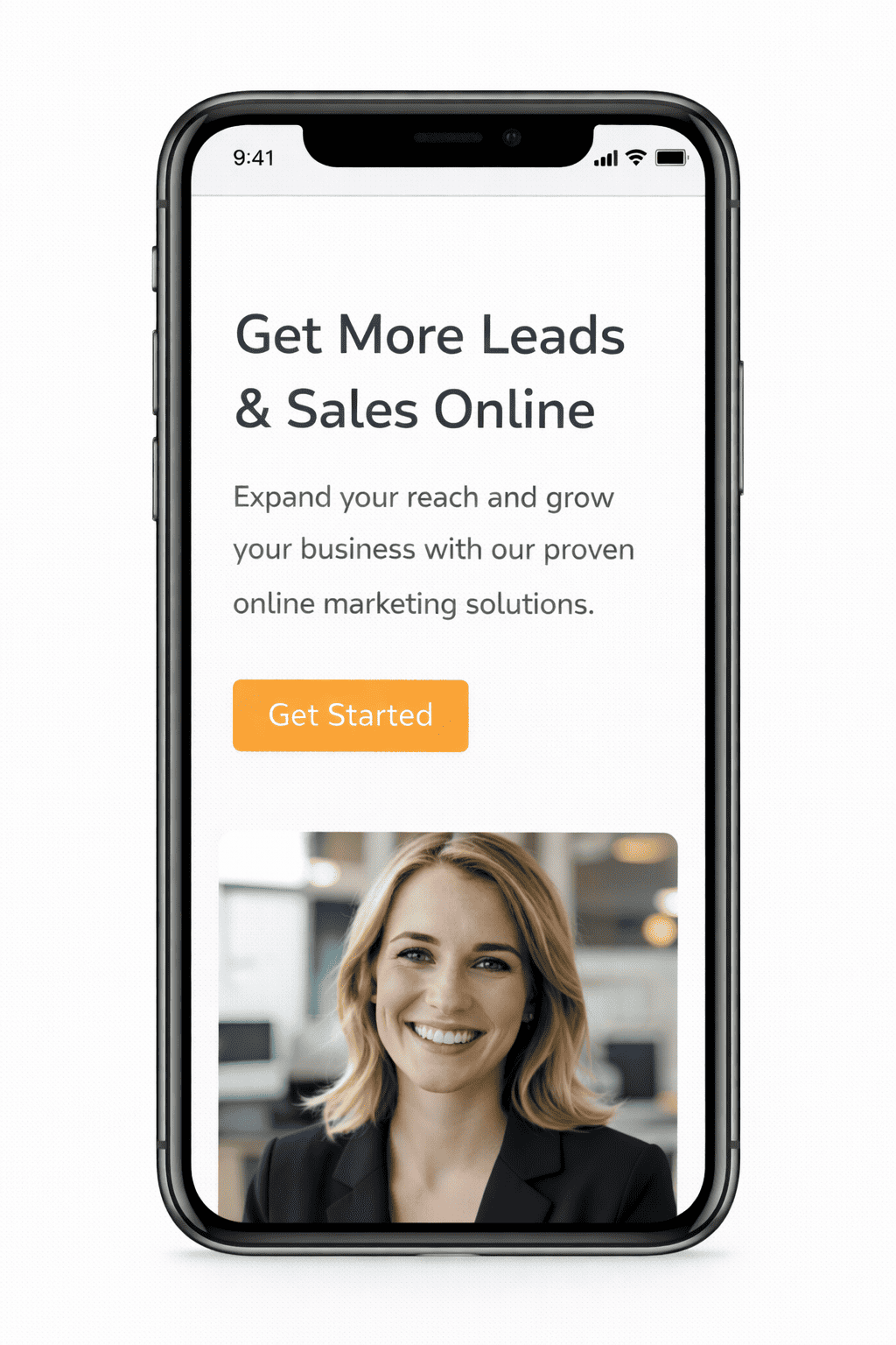
The top section, the hero section, does most of the heavy lifting.
If the hero is weak, the rest of the page struggles.
A strong hero answers four things fast.
Here is a hero structure you can reuse.
Do not waste the hero with vague words.
Avoid headlines like:
Those lines say nothing. Your visitor scrolls because they feel unsure.
A landing page should feel like you’re guiding someone through a decision, one small step at a time.
Here is a page flow that works for most offers.
Think of it as a conversation you would have on a good sales call, but in a calm, written format.
Here are common sections that support that flow.
People do not read landing pages in order. They scan, then they decide what to read.
So your benefits must be scannable.
Use short benefit bullets with a short heading, then one clear sentence.
A mistake I see often is feature lists that read like a manual.
Instead of “Includes 10 modules,” say what that gives the person.
Instead of “Weekly calls,” say what changes because of those calls.
Visuals are not there to make your page look busy. They are there to reduce confusion and increase trust.
Pick visuals that do at least one of these jobs.
If you use stock photos, be careful. People sense fake energy fast. If the photo feels like an ad, it can hurt trust.
People do not avoid action because they are lazy. They avoid action because they feel risk.
Your job is to reduce that risk in a simple way.
Here are ways to do that.
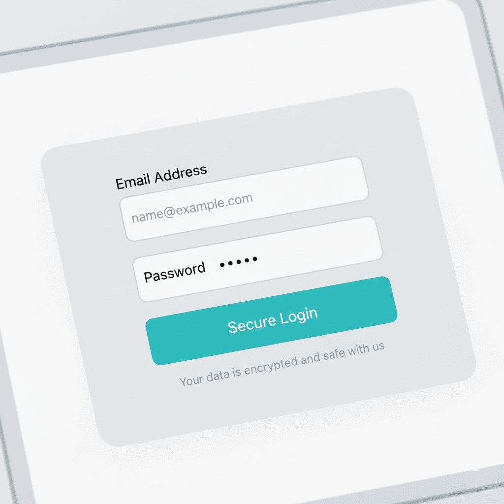
If you use a form, keep it short.
If you ask for too much too soon, people leave.
Trust is not a badge you paste at the bottom. Trust is the feeling that you understand the visitor and that you can deliver.
Here are trust elements that work well on landing pages.
If you do not have much proof yet, you can still build trust.
Objections are normal. Your visitor has them even if they never say them out loud.
A great landing page answers them calmly.
Here are the most common objections you should cover.
A simple “This is for you if” section can do a lot.
This matters more than many people want to admit.
A landing page that looks fine on desktop can feel painful on mobile.
Here are the mobile checks I always do.
If you build in a page builder, preview the page on a real phone. Not only in the editor.
Let me call out a few patterns that quietly ruin good pages.
When you fix these, your page often improves without a redesign.
Step | What you do | Done looks like |
1 | Pick one goal | One primary action |
2 | Write your promise | Clear outcome in plain words |
3 | Build the hero | Headline, subheadline, button, trust line |
4 | Add benefits | Three to six benefit bullets that scan well |
5 | Add how it works | Three steps that feel doable |
6 | Add proof | Testimonials, results, sample, or case study |
7 | Add objections | FAQ and “This is for you if.” |
8 | Check mobile | Button and message show early |
9 | Improve speed | Compressed images, clean layout |
10 | Add tracking | Track the one main action |
If you want a practical plan, use this checklist in order. If you follow these steps, you will end up with a page that feels clear and trustworthy. That is what exceptional pages do. They reduce confusion and reduce risk.
You’ve probably thought about this already. Build a website, create a simple page, maybe sell a course or digital product online without writing a single

Most business owners look at their profit and loss statement only when tax season rolls around or when their accountant asks for it. I understand
If you run a business, people will look you up. They do it before they call. They do it before they buy. They do it